
Textos por cortesía de Wikipedia
Loshua Topolsky, editor en jefe de la red de noticias de tecnología The Verge, describió la fuente como "limpia y moderna, pero no demasiado futurística; no es una fuente de ciencia ficción"
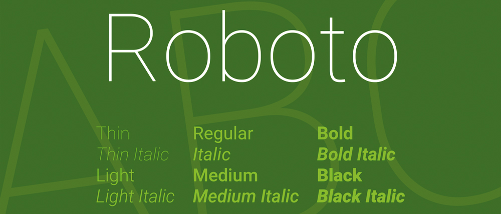
When it came time to talk Ice Cream Sandwich, Matias Duarte started the conversation (or is it lecture?) with a bit about Roboto. At its most basic, Roboto is a font -- the new face of Android in a post Honeycomb world where tablets and phones share the same software space. Sure, it may seem like just another rounded, clean sans serif typeface, but it's really an entire aesthetic that Duarte says has guided the design philosophy of Android 4.0. It's "modern, yet approachable" and "emotional," in PR speak at least. But the clean, geometric design extends to the rest of the OS, which now sports more clean lines, subtle animations and ditches UI elements that have been deemed "unnecessary." Sure, Roboto may seem like "just a font" to you, but for the folks behind ICS, it's a mindset.